 Gothic Home Decor
Ceilings often get overlooked in home design, but the right ceiling paint color design can transform any room. Whether you’re refreshing a bedroom or reimagining a living space, thoughtful choices here draw the eye upward and set the mood just right.
Why Ceiling Paint Color Design Matters
Your ceiling acts as the fifth wall, influencing how light plays in a room and how spacious it feels. A smart ceiling paint color reflects natural light to brighten dim corners or adds warmth to cozy nooks. Homeowners in 2026 are ditching plain white for bolder options that make spaces feel alive and personal.
Gone are the days of defaulting to stark ceilings. Today’s paint color design trends focus on harmony with walls and furniture, creating balance without overwhelming the eye. It’s about making your home feel taller, calmer, or more inviting—whatever suits your lifestyle.
Timeless White and Neutral Tones
White ceilings remain a staple in ceiling paint color because they bounce light around, making rooms feel airy. Opt for warm whites like creamy or soft ivory instead of harsh bright whites to avoid a sterile look. These neutrals pair well with any wall color, from bold blues to earthy greens.
In small spaces, a neutral ceiling paint color design keeps things open and breathable. Think of it as a blank canvas that lets wall art or furniture shine. For a subtle twist, layer in off whites with faint beige undertones—they hide imperfections better than flat white and add a touch of elegance.
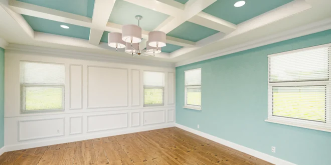
Bold Two Tone Ceiling Paint Color Design
Two tone paint color design is surging in popularity for its depth and drama. Paint the center one shade and edges another—like pale gray meeting deep navy—for instant architectural interest. This technique fools the eye into seeing height, perfect for low ceilings.
Living rooms love this approach. A lighter central ceiling paint color design with darker borders frames the space like artwork. It works in dining areas too, where recessed edges in charcoal against a soft taupe ceiling create a sophisticated backdrop for gatherings. Test samples in your lighting to ensure the contrast feels balanced, not jarring.
Soft Pastels for Serene Spaces
Pastels bring a fresh vibe to ceiling paint color design, especially in bedrooms and nurseries. Shades like blush pink, mint green, or lavender wash the room in gentle light, promoting relaxation without dominating. These colors reflect softly, enlarging compact rooms visually.
Pair a dusky blue ceiling with cream walls for a coastal feel, or lilac over beige for romantic charm. In ceiling paint color design, pastels shine under natural light—daytime feels brighter, evenings cozier. Matte finishes enhance their subtlety, diffusing glare while hiding ceiling flaws like cracks or uneven textures.
Warm Earthy Hues in Ceiling Paint Color Design
Earth tones are grounding choices for ceiling paint color design, adding warmth to modern minimalist homes. Terracotta, soft ochre, or muted sage mimic natural elements, drawing from 2026 trends toward organic palettes. They pair beautifully with wooden beams or stone accents.
Kitchens benefit hugely—imagine a warm camel ceiling over white cabinets to soften harsh fluorescents. This ceiling paint color design approach feels lived in and timeless, resisting fads. Apply in eggshell sheen for easy cleaning, as these hues camouflage splatters better than gloss.
Dramatic Dark Ceilings
Don’t shy from dark ceiling paint color design; it cozies up lofty spaces and hides imperfections. Deep charcoal, navy, or even black creates a moody, intimate atmosphere, like a starry night indoors. Perfect for media rooms or studies where focus matters.
Balance with lighter walls and metallic accents—gold lamps pop against a sooty ceiling. In ceiling paint color design, dark shades absorb light, so layer LED strips for subtle glow. It’s bold but forgiving, muting noise visually in open plan areas.
Perfect Wall Ceiling Pairings
Great ceiling paint color design starts with wall harmony. Match ceilings to walls for seamless flow in monochromatic schemes, like pale gray throughout. Or contrast: deep green walls under a crisp white ceiling for crisp definition.
For energy, try soft yellow walls with a sky blue ceiling—light feels endless. Bedrooms thrive on cool tones: powder blue walls and matching ceiling for calm. Dining spaces? Warm beige walls under terracotta ceiling paint color design for appetite boosting vibes. Always consider furniture—neutral sofas ground vibrant ceilings.
| Room Type | Ceiling Shade | Wall Shade | Effect |
| Bedroom | Lavender | Pale Gray | Restful |
| Living | Soft Blue | Off White | Airy |
| Kitchen | Warm Beige | Crisp White | Cozy |
| Dining | Charcoal | Terracotta | Dramatic |
Lighting’s Role in Ceiling Paint Color Design
Lighting changes everything in ceiling paint color design. Cove LEDs amplify pastels, casting ethereal glows along edges. Recessed spots highlight two tone effects, while pendants showcase matte textures.
Natural light demands lighter ceiling paint color design to maximize bounce—north facing rooms need warms like cream. Artificial setups? Darker shades with warm bulbs (2700K) prevent cave like feels. Test at different times—morning sun alters hues dramatically.
Choosing the Right Paint Finish
Finish defines your ceiling paint color design. Matte hides bumps and absorbs light, ideal for imperfect surfaces. Eggshell offers gentle sheen and washability for high traffic spots.
Satin works for moisture prone areas like bathrooms—it resists stains in bold ceiling paint color design. Avoid gloss; it spotlights flaws. Low VOC formulas ensure safe, odor free application, crucial for family homes.
Step by Step Application Tips
Prep sets success in ceiling paint color design. Clean thoroughly, repair cracks with filler, and prime for even coverage. Use angled brushes for edges, rollers for flats—extendable poles save your neck.
Two coats minimum, thin layers to avoid drips. Start in corners, work outward under good ventilation. Dry 24 hours between coats. For murals or stencils, seal first—adds personality to custom ceiling paint color design.
Common Mistakes to Avoid
Rushing color choice kills ceiling paint color design potential. Skipping samples leads to regrets—paint shifts under your lights. Overly bright whites yellow over time; choose quality tints.
Ignoring room use? Dark ceiling paint color design in tiny kitchens feels oppressive. Poor prep shows through—always sand smooth. Neglect trim; crisp lines elevate the whole look.
2026 Ceiling Paint Color Design Trends
This year, ceiling paint color design leans organic: faux wood effect paints mimic beams affordably. Murals in abstract florals add whimsy. Two tone with pastels dominates, per design pros.
Sustainable low VOC paints rise, in hues like Silhouette (charcoal umber) from trend palettes. Pair with smart lighting for luxury on a budget. Expect more textured finishes hiding roller marks seamlessly.
Budget Friendly Ceiling Paint Color Design Ideas
Revamp without breaking bank single accent walls with matching ceilings cost little. DIY two tone: painter’s tape and two quarts suffice small rooms. Shop sales for premium paints—worth the coverage.
Faux finishes via sponges create depth cheaply. Upgrade trim paint for polish. Total refresh under $200 possible with smart ceiling paint color design.
In wrapping up, mastering ceiling paint color design elevates your home effortlessly. From pastels soothing bedrooms to dark dramas in dens, endless options await. Pick what sparks joy, test thoroughly, and watch spaces transform your ceilings deserve the spotlight.